

Inspired by the original Oasis identity, the new mark has been developed with gradual but subtle changes.
There are many facets to the Oasis community. We have multiple products and audiences. So within our master brand identity, individual business areas are designated their own signature identities.
Each family will have its own colourway consisting of a core colour and tonal differentiator, with a consistent grey palette serving as a unifying visual thread throughout.
Our brand mark has a warm and inviting persona. We have removed sharp angles to build a sense of movement and fluidity in our aesthetic.
A continuous flow now runs throughout the master brand logo mark, giving it a sense of motion, momentum and progress.
The characters act in unity to create a connected symbol that becomes a neutral mark for multiple verticals.
The mark is the central pillar of our identity and should never be compromised. Please use the logo mark correctly at all times, respecting the rules set out in this guide.
Key areas of creative development
Old logo
Group Logo
The positive colour version of the Oasis logo is the core element of the overall group visual identity.
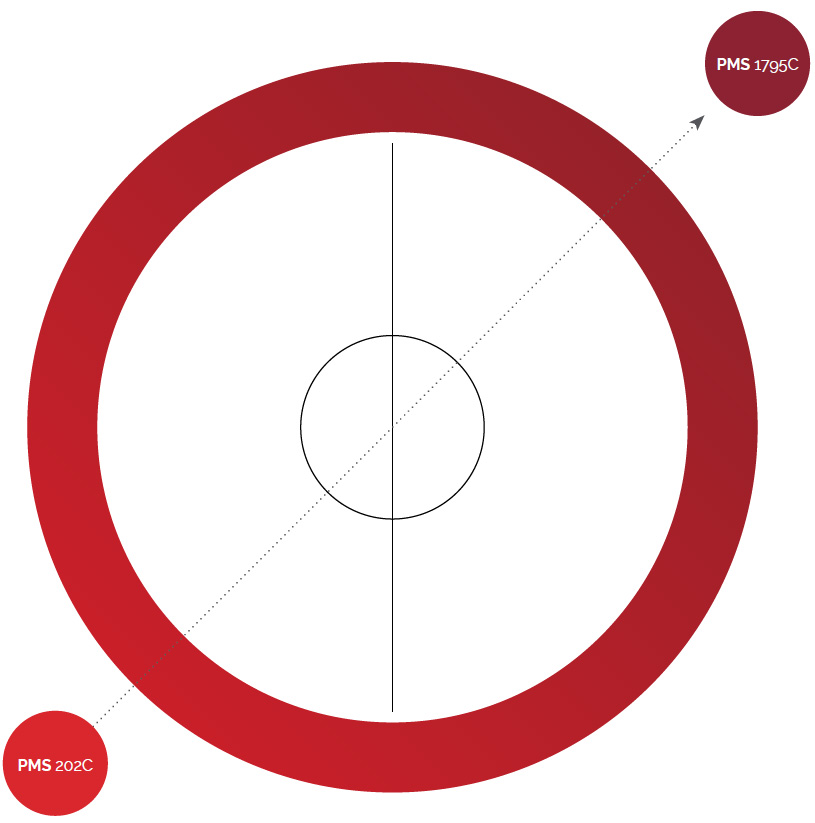
For printing purposes, the key corporate colour of the Oasis Brand corresponds to a bespoke gradient of PMS 1795 C at a 45 degree angle
to PMS 202 C.
Never alter, modify or use the logo with other elements, except those described in this document.
Only reproduce the logo from the digital master file. Copies reproduced from printed samples, that is to say, copied directly from this manual or other printed material should be avoided.
Exclusion zone
Minimum size (Print)
32mm / 9.8mm
Minimum size (Digital)
378 px / 100px
Special focus and attention to using the lock ups is very important to preserve the brand’s integrity. Please follow the minimum size guides and obey the exclusion zones.
These have been specifically set up so the logo can be used at its smallest point without losing any quality and legibility.
The boundary boxes show the breathing space that is needed, no other imagery, logos or copy should cross into this area. It is essential to ensure high resolution files are used at all times with no pixellated logos.
To do this it’s best to use the official EPS lock up files (other files include PNG, JPEGs depending on use).
Colours have been identified for each sub-brand and its key to keep to the individual colour themes throughout all collateral being produced.
If in doubt, refer to this guide and use the correct colour codes for the software you are using (RGB for digital, CMYK/PMS for print).
Introducing the family brands means a new logo lock up.
As before, this has been inspired by elements in the original mark. The sub-brand sits in line horizontally, on the right side of our master brand.
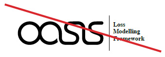
Oasis Loss Modelling Framework
The typeface is 50% smaller than the circle safe free zone. There is an introduction to a key line to help lock the master brand to the sub-brand.
Sub-brand name always appears in RALEWAY Semi Bold (Caps).
When an extended sub-brand name is required, the brand may be taken over two lines.
The leading is always equal to the point size of the typography and the combined height will never be greater than x.
Oasis Partners
The partners brand is for those using Oasis to launch new projects and services.
Displaying partnerships at the right time and place is integral to communicating the relationship we have with our wider associates.
Partnership associations should always be written in Sentence case and in Raleway Light Italic. The partnership sits on the exclusion zone. The x
height of the copy is always equal to the height of the Oasis flow.
Please request all new logos from your creative partner.
Sub Brand lock up
Improper Use of Logo
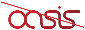
The logo should never be produced in any colour other than the primary corporate colours.
Respecting the brand logo lock ups and the rules set in place help create a consistent brand across all collateral produced for and on behalf of the organisation. The logo is the face of the people who work there and what the brand represents, it is integral to respect the logo in all lock up forms, to abide by the rules and to avoid all examples of misuse on this page.
Do not break any typesetting rules for additional sub brands

Do not customise fonts for additional sub brands

Do not change the colour of any logo lock ups
Do not alter or customise any branding

Do not add any styles like glows, drop shadows or artistic effects
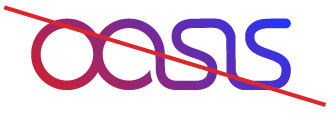
Do not customise the gradient
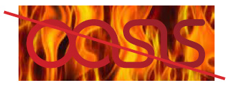
Do not overlay Logos on contrasting imagery

Do not stretch or skewany logo lock ups
Colour
We have chosen specific colour schemes that best represent the current sub-brands. The current colour structure is simple and works on a tonal basis. Each sub-brand has its own personal colour scheme.
Hero — inspired by existing branding, a subtle gradient at 45° using the core red and a darker tone. The use of a gradient helps differentiate the Master brand to the flat colours of the sub-brands.
Primary
PMS 1795C
C:11 M:100 Y:97 K:2
R:212 G:31 B:41
PMS 202 C
C:28 M:96 Y:84 K:30
R:139 G:33 B:41
Secondary
PMS COOL GREY 11C
C:65 M:57 Y:52 K:29
R:85 G:86 B:90
PMS COOL GREY 8C
C:48 M:40 Y:38 K:4
R:138 G:138 B:141
45° Linear Gradient
Red hues indicate:
passion, energy, strength and maturity.
Primary
PMS 1795C
C:9 M:98 Y:93 K:1
R:217 G:39 B:45
Secondary
PMS 202C
C:29 M:96 Y:76 K:29
R:140 G:34 B:50