

Our corporate font is Raleway. Raleway embodies all that we believe in as an organisation: open source and available for all to use.
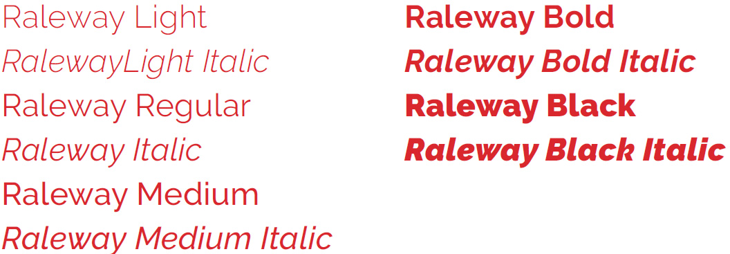
Raleway is an elegant sans-serif typeface family designed for headings and other large-size use. Its multiple weights give it a clean and contemporary look and feel.
Raleway is available as an open source font via Google. We use Raleway in all deliverables for consistency, within and between multiple markets.
Typography
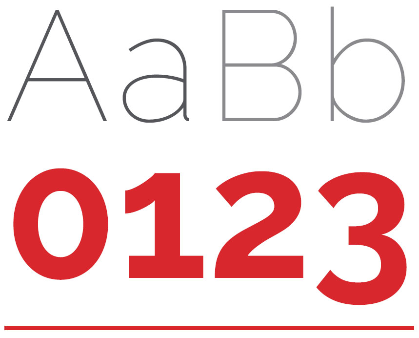
Raleway is a display font featuring both old-style and lining numerals, standard and discretionary ligatures, and a complete set of diacritics.
Initially designed by Matt Mcinnerney as a single thin weight, it was expanded into a 9 weight family by Pablo Impallari and Rodrigo Fuenzalida in 2012 and iKerned by Igino Marini.
Available Weights
Raleway is available as an open source font - free to download at
https://fonts.google.com/specimen/Raleway
Using Raleway
The first step to perfecting any new font is adjusting the leading, kerning and tracking, which affect the line spacing, letter spacing and text to make it proportional, readable and appealing.
Leading is an essential design aspect that determines how text is spaced vertically in lines. For content that has multiple lines of readable text (like this document), you’ll want to make sure the distance from the bottom of the words above the top of the words below has appropriate spacing to make them legible.
The leading is measured from the baseline of each line of text where the letters sit. Traditionally, leading should be 20 percent greater than the font size; however, individual styles may call for different distances.
Tracking is often confused for kerning, but the concept is a little different. Tracking involves adjusting the spacing throughout the entire word. Once you’ve determined the right spacing between each letter, tracking can be used, with great restraint, to change the spacing equally between every letter at once.
Tracking is generally used to fill a space that’s larger or smaller than currently suits the type’s parameters or to make a single word seem airy and impressive. You should be very careful when changing the tracking, as it can quickly lead to difficulty in reading.
Kerning also adjusts space, but of the distance between two letters. Set too closely together, words are indecipherable; set too far apart, and they’re awkward to read. Worse yet, if some letters have wider spacing and others narrower, it can be frustrating for someone to read without fully understanding what’s wrong. One of the most important aspects of successful kerning is to have proportional spacing between each letter.